Rx Transfer Experience
Building trust and improving patient acquisition
Owned UX and UI across platforms, including problem-framing, research, design strategy, execution, and cross-functional alignment.
Role
Duration
8 Weeks
Tools
Figma, Mural, UserZoom, Teams
Overview
Kroger pharmacies serve millions nationwide, with prescription transfers often being a customer's first digital interaction, crucial for building trust and engagement. I led efforts to enhance the digital Rx transfer experience across web and mobile, addressing issues of clarity, efficiency, and visibility that hindered conversions and trust.
This initiative involved three overlapping phases, balancing immediate business needs with scalable long-term solutions within the health ecosystem.
Core Challenges
Long forms, especially for new patients
Manual, repetitive data entry when transferring multiple prescriptions
Data accuracy dependent on manual entry
Limited transparency after submission
Mental models around account requirements

Design Strategy
Reduce perceived effort
&
Build trust through clarity
Phase 1
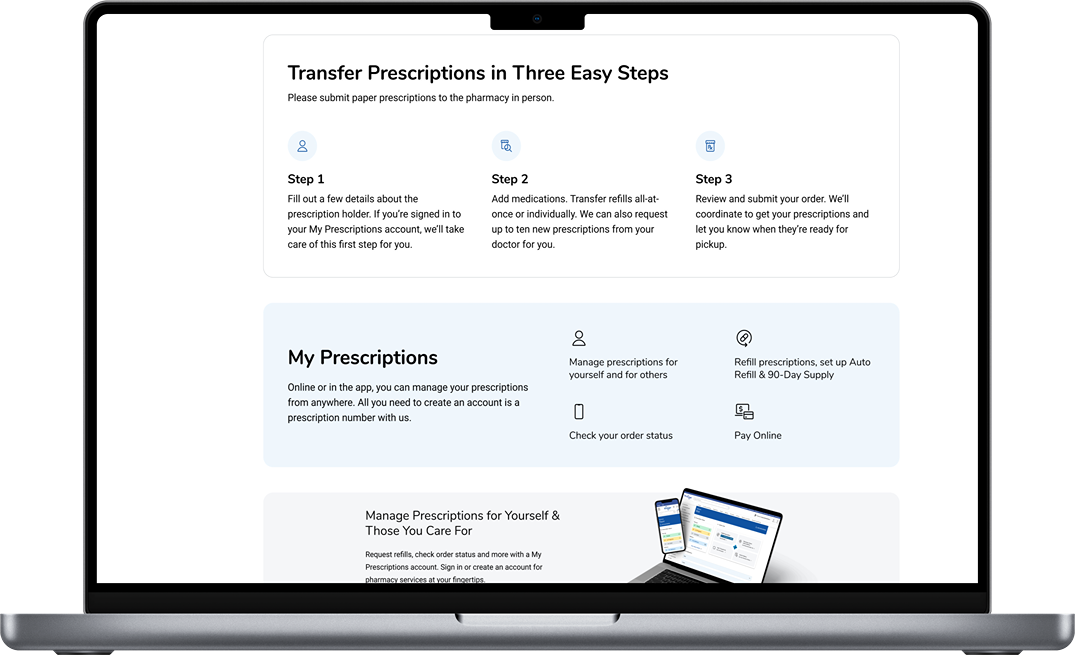
Core Flow Redesign
Unlocked operational value by enabling notifications, improving follow-through and pickup rates.
Key improvements
Express consent enabled SMS notifications, even for users without an account, closing a critical communication gap where users previously submitted a transfer with no visibility into progress
Previously, customers transferring multiple prescriptions had to manually re-enter the same pharmacy information repeatedly.
Introduced “Transfer All Active”
Reduced input fields from 4 to 2
Eliminated redundant data entry
Significantly lowered effort for users switching pharmacies
Improved transparency, orientation, and readability
Phase 2
Competitor Selector
Added a searchable competitor pharmacy selector, reducing the need for users to look up information outside the app
Improved accuracy of information received by associates, which translated to time and cost savings
Visual & Content Enhancements
In addition to the feature addition, this phase allowed for further improvements to hierarchy and layout, and the opportunity to provide clearer instructions throughout the flow.
Phase 3
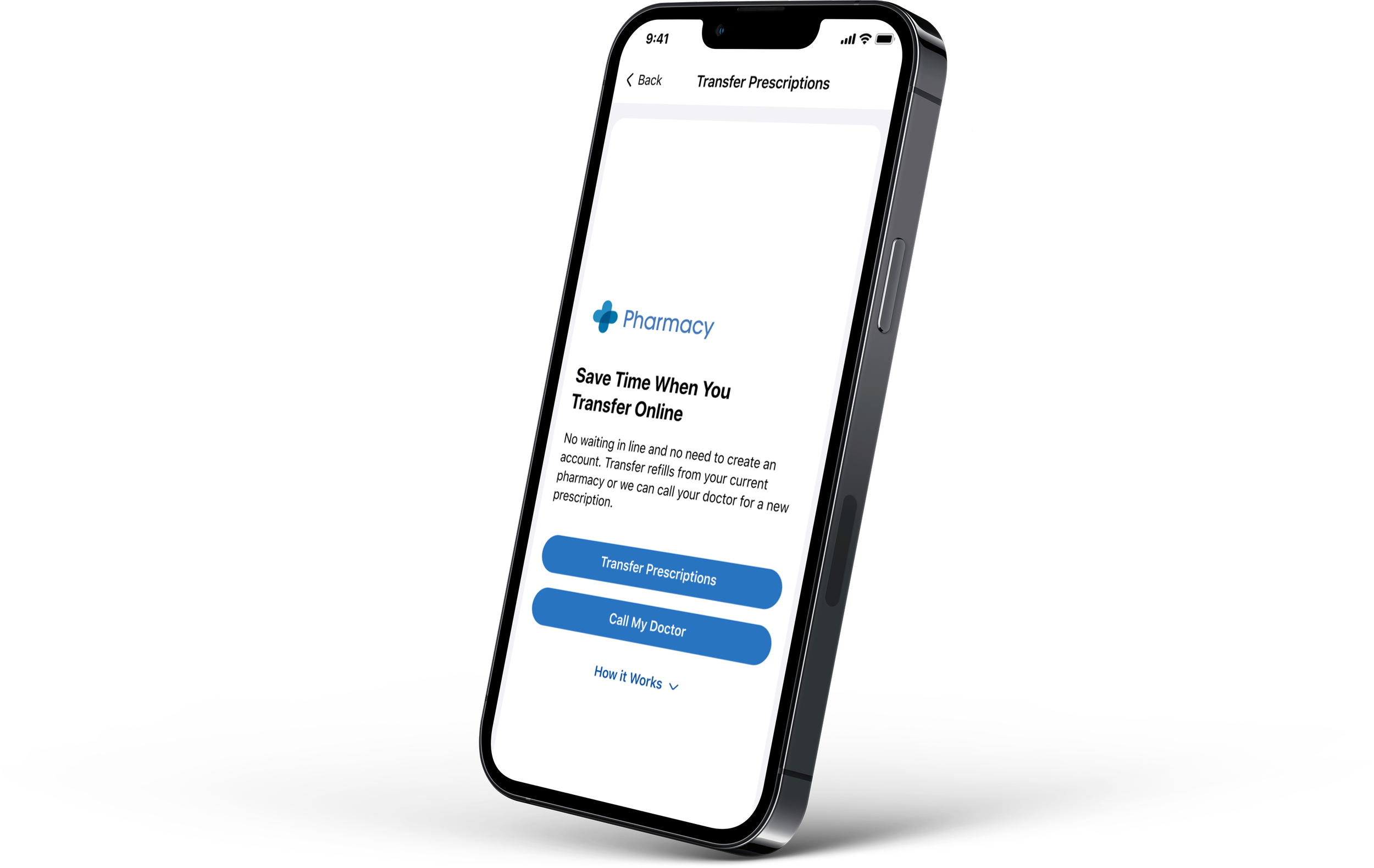
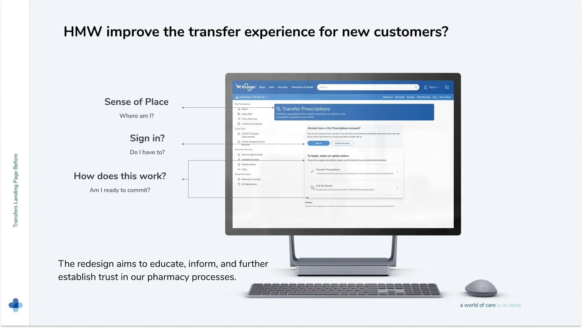
Entry Point Focus
Users access transfers via website, QR codes, and campaigns without prior context. The landing page must quickly orient users and build trust.
Research-driven insights
Users expected that an account was required before even seeing the page
This mental model existed prior to interaction, not because of UI placement
Users wanted reassurance about refills, tracking, and next steps
Method
Study 1: Unmoderated usability + questionnaire (45 participants, web)
Testing sign-in component placement and presence, I found no significant change in perception across variations. Participants entered the experience relying on their own mental model - “I need an account.”
Study 2: Redesigned concepts (60 participants)
Redesigned concepts tested revealed an improved understanding that an account is optional. Confidence improved modestly, but clarity increased.
Users still wanted more upfront insurance information (not technically feasible yet)
Outcome
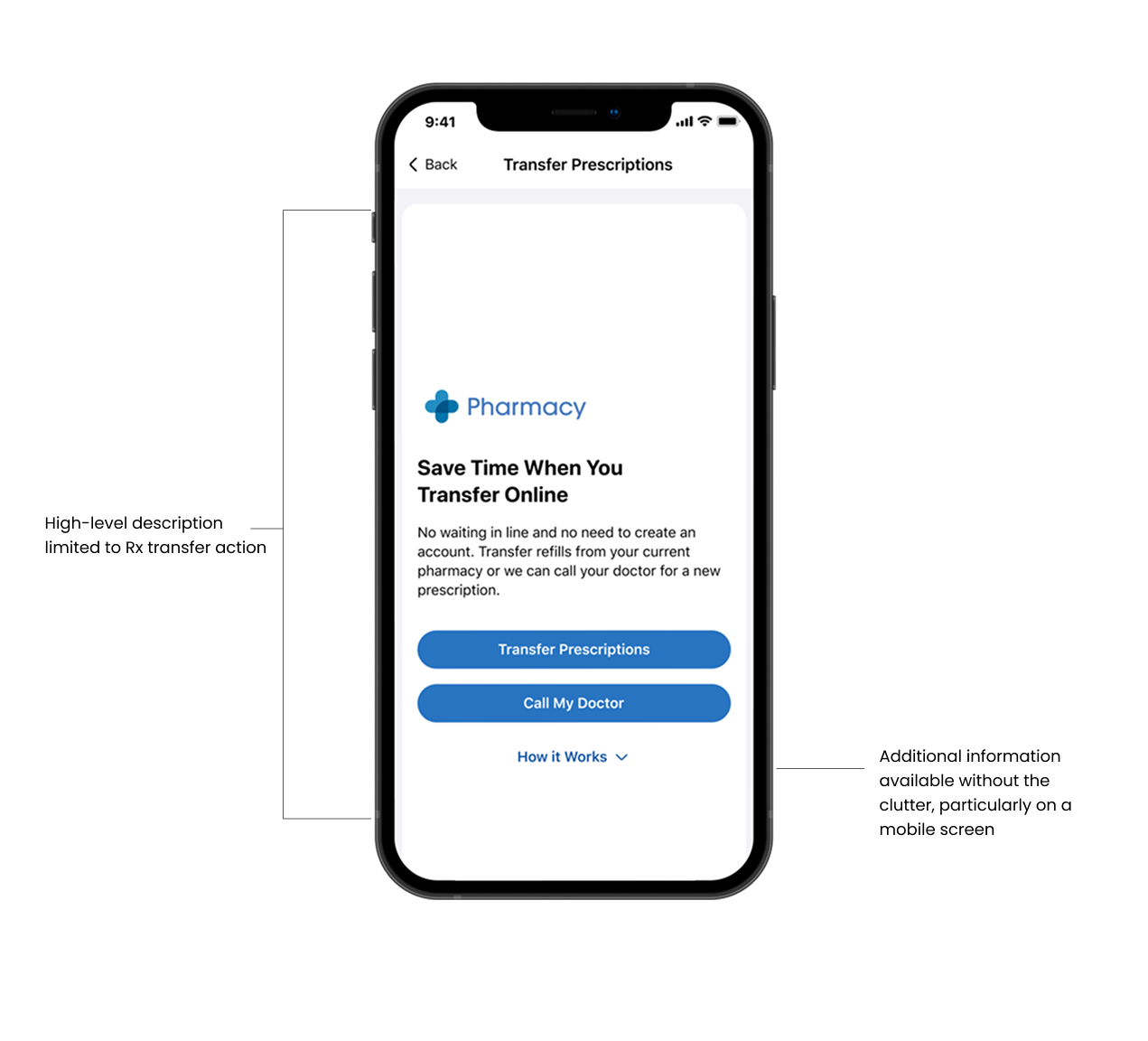
Refined copy to minimize cognitive overload and improve overall clarity
Encouraged sign-in as a time-saving benefit, not a requirement. In addition to copy updates, the sign-in component was moved to the bottom of the entry screen, with a subtle sign-in link added on step one.
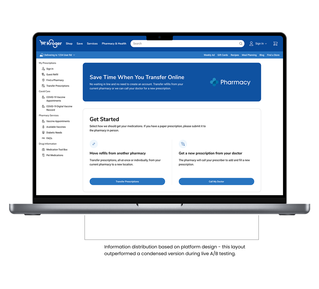
Lastly, we ran a live A/B test and optimized layouts separately for native and web, recognizing platform-specific design needs.

Results & Impact
The redesign more than doubled transfer conversion, increasing completion from 24.78% to 56%+, with additional gains driven by improved landing page clarity and trust-building patterns. Each phase addressed a distinct friction point - flow complexity, data accuracy, and first-time user confidence - resulting in sustained performance improvements.
Incremental conversion gains driven by phased UX, UI, and messaging improvements across web and native platforms.
Learnings
Design is never truly done—there’s always room to refine and evolve. Having the opportunity to iterate allowed me to launch quickly, learn from real users, and make incremental updates that drove meaningful impact with each release. Working closely with product partners, AX counterparts, and developers helped uncover opportunities to streamline the experience for both customers and associates. While no design is ever perfect, I’m confident this work left the transfer flow in a much stronger place—simpler, clearer, and more effective for the people who rely on it.